 Add Row
  Add
Add 

Discover the Allure of Barely-There Colors
Choosing the right paint color can transform your home, creating a space that looks and feels more inviting. For homeowners in the MidSouth, understanding the subtleties between bold colors and neutral tones is essential to achieving a serene and harmonious environment. Barely-there paint colors, often softer shades that whisper rather than shout, represent a growing trend that goes hand-in-hand with wellness and health-conscious living. In this article, we'll explore how subtly nuanced paint colors can enrich your home while keeping your overall wellbeing in mind.
Why Choose Subtle Hues for Your Home?
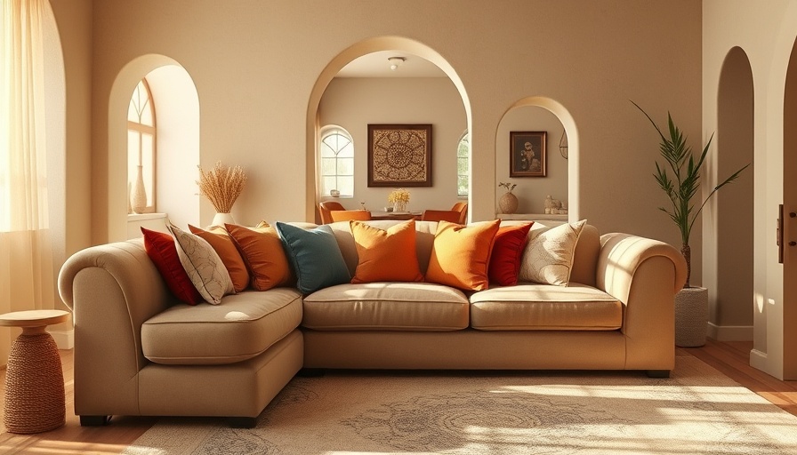
Subtle paint colors offer a myriad of benefits, primarily focusing on creating a calming atmosphere. Unlike stark white or overpowering colors, muted shades allow for greater flexibility in decor, enhancing furniture and lighting rather than competing with them. Additionally, various architects and designers have highlighted that these slight color variations can influence how we perceive our own skin tones, making us feel healthier and more confident in our living spaces.
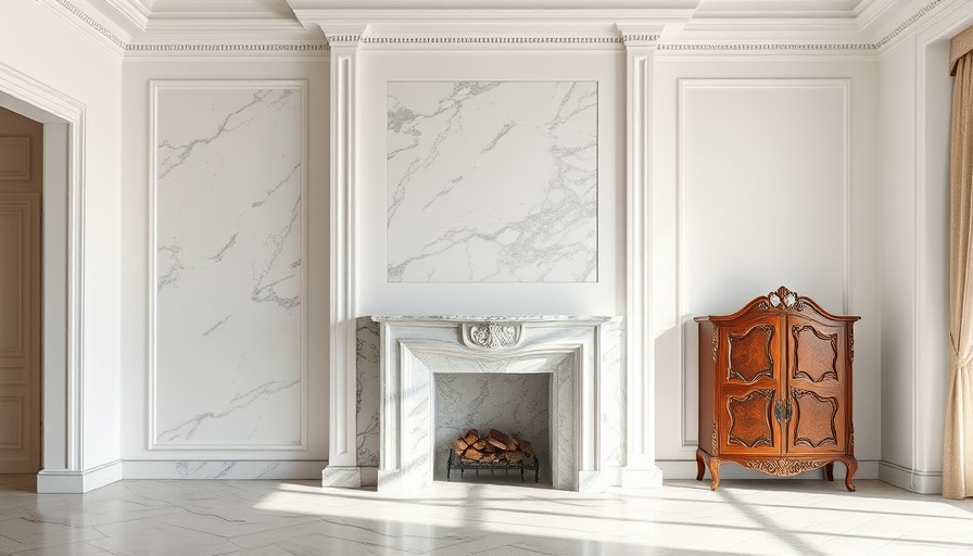
Architects’ Picks for Barely-There Colors
Influenced by trends in health and wellness, architects worldwide are opting for shades that incorporate warmth and softness. Renowned architects like Ronan Le Grand and Konrad Steffensen from Corpus Studio have praised Farrow & Ball’s “Pointing,” a warm creamy yellow-white that breathes life into any room. This gentle hue is particularly effective for creating a cozy environment in urban apartments, enhancing natural light without overwhelming the senses.
Another popular choice is “Sable Gris” from French manufacturer Argile, beloved by architect Anki Linde. This grey-pinky white offers an understated elegance, perfect for bedrooms where tranquility is paramount. The subtle pink undertones help provide a softer radiance, making the room feel more inviting.
Color and Light: The Dynamic Duo
Understanding how light plays with color is vital when selecting your home palette. Architects Leah Korzeczek and Matthias Hiller from Studio Oink applied “Elephant’s Breath” in their designs, highlighting its dynamic nature that can shift from a warm grey to a blue-tinted hue based on the time of day and room light. This versatility not only enriches the space but also keeps it visually interesting, appealing to the senses without overwhelming them.
Tips for Incorporating Barely-There Colors in Your Home
When embracing subtle shades, consider how they will interplay with your existing furnishings, lighting, and room purpose. Here are several tips to ensure your selection enhances your environment:
- Test Samples: Always test paint samples on the wall before committing. Observe how they change under different lighting conditions throughout the day.
- Monitor the Mood: Choose colors that resonate with the intended atmosphere of the room. Soft whites and pale greys can transform a space into a peaceful retreat.
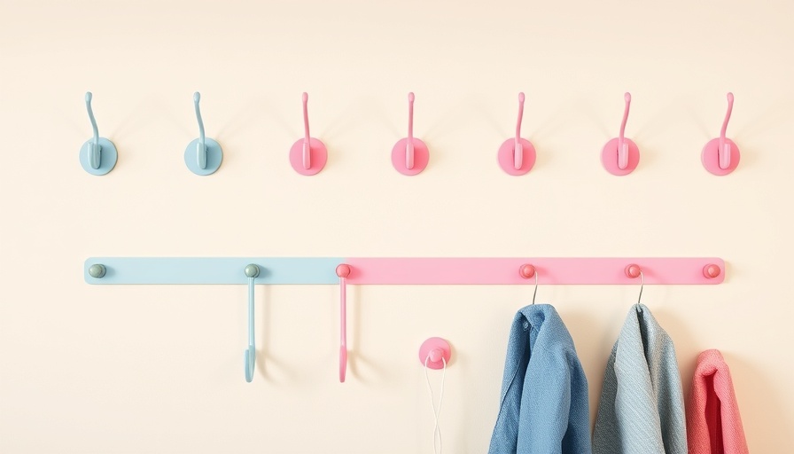
- Coordinated Decor: Enhance the chosen colors with decor that complements them. Whimsical art pieces, textured fabrics, and natural materials can elevate the look.
Final Thoughts: Elevating Your Space with Color
Ultimately, choosing the right paint color is about more than aesthetics; it's about creating a space that fosters health and wellness. As homeowners in the MidSouth, understanding the psychological and sensory impacts of color can profoundly affect how we experience our homes. By embracing barely-there hues, you not only enhance your interior but also contribute positively to your daily life. So, whether you're planning a refresh or an entire renovation, consider how the right color can transform your space and reflect your unique style.
Are you ready to explore the world of color in your own home? Dive into paint samples and experiment with different shades that resonate with you. Transforming your living space begins with that first brushstroke!

Write A Comment